


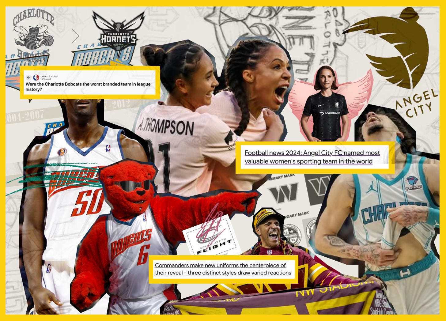
Intro
Welcome back, friends and fans of fitness branding and marketing. Shortly after this publication launched, I ran off to climb a mountain in Tanzania and let these essays rot in my drafts. In a thank you for your patience or, better yet, an apology for leaving your inbox high and dry, I’m opening the newsletter back up with a meatier exploration of rebranding in the electric and often fraught world of sport. Call this an ode to March Madness, or an elaborate response to the question I get frequently asked at my branding studio day job, “what kind of ROI can I expect to see from this rebrand?”
Let’s dig in.
Section one: life imitates art sport
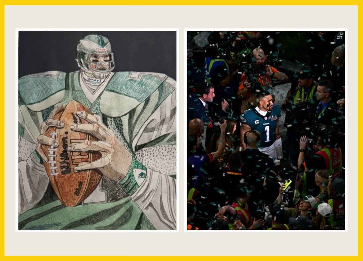
As a chronically online graphic designer who moonlights as a sports fan (with a decent record too: I can now pin the badge of honor of being both the commissioner and WINNER of my all-women fantasy football league: Betches and Balls), my eyes are glued to the screen anytime I see a team tackle a rebrand. A rebrand in the world of sport is always electrifying - quite simply because people care. Deeply. A team is often a core piece of an individual’s identity - and the reaction to change is often so extreme because fans see the change to their team’s identity as a change to their own.
I personally believe that any great brand closely mirrors that of a sports team. Consumers are fans: intensely loyal beyond a single product, deeply invested in and critical of changes made, and, ultimately, ride or die.
Because of this, I see obvious parallels in what makes the success and failure of rebrands from sports directly to business. The extreme emotion of sports can illuminate branding principles so brightly and so obviously that we wonder how we missed them in the first place. So - let’s analyze them, shall we?
Section two: defining success, and more importantly, defining failure
One of the biggest misconceptions when it comes to a rebrand, IMHO, lies in what makes it successful. When I work with founders on a rebrand effort, nine times out of ten the initial question asked is “what’s the ROI we’re going to see from this project.” Often the trap we find ourselves in is to echo the overall consumer sentiment after a brand rollout about how the logo looks after and calling it a day. But when a team is investing millions in a rebrand effort (typical spend for a team rebrand ranges from $3M for slight aesthetic updates to $15M+ for complete renaming,) we suddenly realize that “loving the logo” doesn’t quite justify the spend.
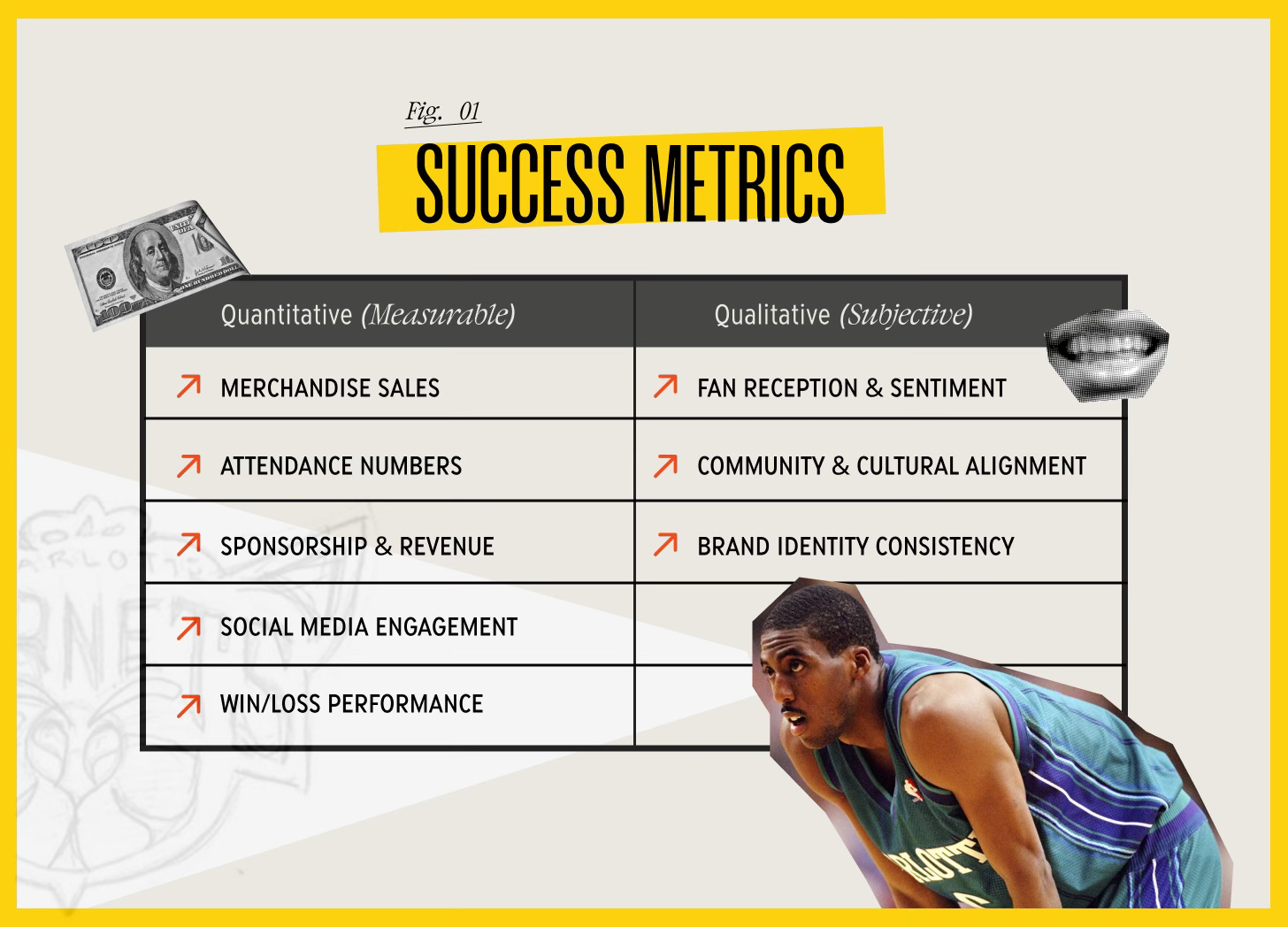
To make the juice worth the squeeze, a rebrand's success or failure can be evaluated based on several key metrics that fall into two buckets: quantitative (measurable) and qualitative (subjective).
If your eyes are glazing over, stick with me—because now we get to the juicy part. Let’s break down some real-world winners and losers in the rebrand game.
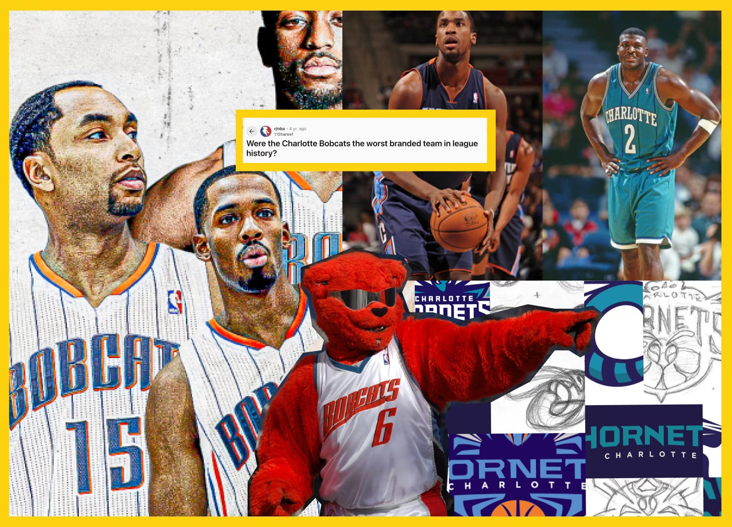
Enter the success story that is NBA’s Charlotte Hornets. In 2014, they ditched the Bobcats name (which, let’s be honest, never quite landed) and reclaimed their original identity. And they were rewarded with a 77% spike in merch sales and attendance numbers that shot up six spots in the NBA rankings - fans practically threw their money at the team. I also dole out bonus points for rolling out the brand with an experiential marketing campaign that went directly to their fans —they sent their mascot, Hugo the Hornet, out into the community like a tiny, buzzy evangelist for the rebrand. Smart, effective, and anchoring back to the community.
Now if you want a case study in how not to rebrand a team, look no further than Cardiff City FC’s 2012 identity crisis. In a bid to attract international markets, ownership swapped their beloved blue kit for red. The local fans were not consulted, not happy, and not buying into the corporate logic. Even though the team reached the Premier League, the soul of the club had been shaken—and eventually, they had to backtrack. This backtrack ended up costing the team more money in damage control. The whole ordeal proved that tradition isn’t something you can just edit away for the sake of market expansion.
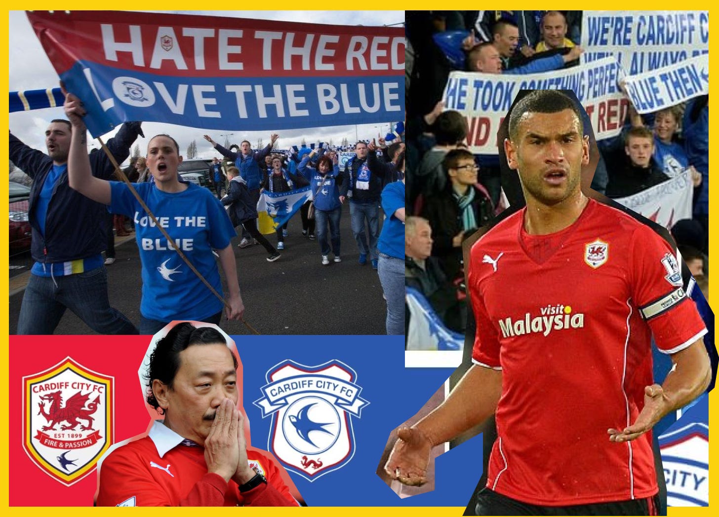
These two examples of wildly different reactions to a major change in brand should serve as both encouragement that change can work and caution that it needs to be approached delicately. A simple rebrand decision can cost millions.
So, how does a team avoid the Cardiff City fiasco and ensure their rebrand lands with fans? Let’s dig into the pre-brand work that works.
Section three: beyond the numbers and into sentiment
My personal thesis, if you will, is that the hack to seeing an actual quantitative ROI from a rebrand is to focus in the beginning not on the numbers, but on fan sentiment. It feels right to take the Cardiff City approach and say, hey, we want to expand into international markets, the right chess move is to recolor the team to a luckier, more marketable color in Asia. But if they had come at the rebrand from a fan-sentiment-centered approach, the solution might have avoided the expensive fallout the team experienced.
Let’s pull in a rebrand example that I think really illustrates this point - The Washington Commanders. In July 2020 the Washington Football Team retired its previous name, the "Redskins," which had been rightfully criticized for its offensive connotations towards Native Americans. After a period as the "Washington Football Team," the franchise announced its new identity as the "Washington Commanders" on February 2, 2022.
Now, I love this example because not all rebrands are as fraught as ones that rebrand for cultural sensitivity. Navigating the minefield of public opinion in the mental pressure cooker that was the pandemic is truly an athletic endeavor. What I think the Commanders did beautifully was all the work leading up to and in the rollout of the rebrand with their fan base. The way the team attacked this challenge was by launching a fan engagement campaign where supporters could submit ideas, provide feedback, and weigh in on potential names. Again, we’re focused on keeping things fan-centered here. They ran surveys, held focus groups, and monitored socials to gauge which name resonated most with their community. The key themes they uncovered in this process were military history, D.C. heritage, and strength.
The next smart play they made was not to rip the Band-Aid off all at once. They kept running with “Washington Football Team” for two seasons, letting fans get comfortable with change before fully committing. After the two seasons, the name Washington Commanders was officially announced on NBC’s Today Show in a controlled, media-heavy rollout featuring lineups of players, former legends, and branding experts to reinforce the messaging. They also didn’t ignore the black box that is social media and directly responded to fans, hyping up the change. Another important key here - the new logos, uniforms, and merch dropped immediately, ensuring that fans could buy in— quite literally—right away.
Now here’s the deal - this rebrand wasn’t without its fair share of criticism and poor reception. Some criticized the name as being generic, while others felt the tie to military really wasn’t a strong enough diversion from the original racist identity. What I think was done pretty excellently is choosing relatively neutral name with a strong thematic tie to D.C. that actually incorporated fan input. The other real win here - they kept an anchoring element the same: the color palette. To many, this felt that the team was still the team they grew up being a fan of while moving past the racist name. To me, it’s a great lesson in how retaining an element of brand recognition can help consumer sentiment in a rebrand.
Section four: executing the rebrand playbook beyond sport
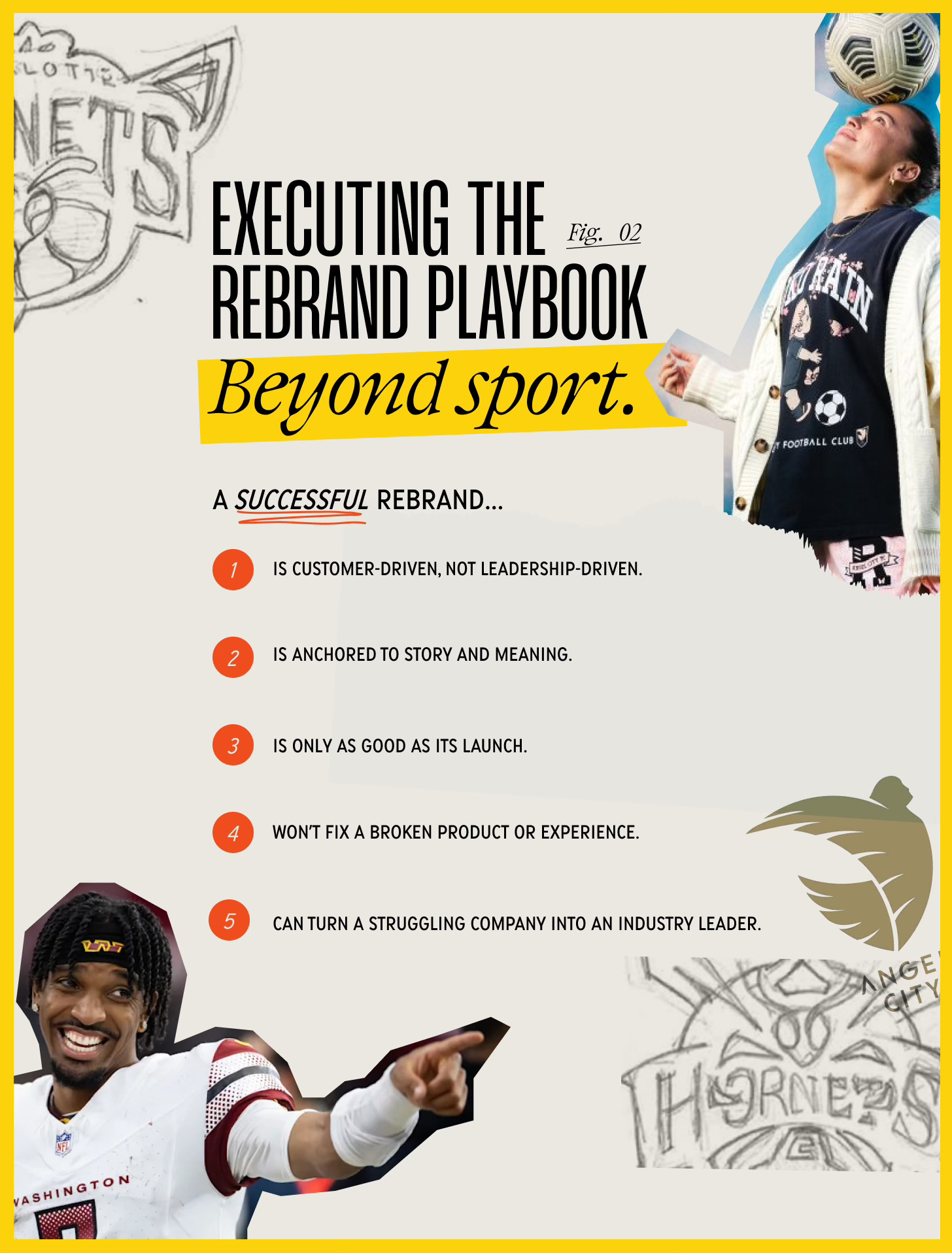
Alright, let’s get down to literal application here with my main takeaways. As I was analyzing sport rebrands for this deep-dive, there seemed to be five key themes surface. Some may seem intuitive, but I find it’s often the most obvious strategies that get overlooked. Maybe because we’re less intentional about the things we assume are obvious? Regardless, let’s get into it.
I believe a successful rebrand…
is customer-driven, not leadership-driven. Use the example of Angel City FC, one of the most profitable teams in the NWSL. They brought in fans early in their branding decisions and thereby created deep emotional buy-in. TLDR here is that companies who involve customers, employees, and stakeholders in their rebranding process build that loyalty and trust needed for a true success. Taken into the real world, look at Airbnb’s logo and visual identity revamp in 2014. Airbnb tested the visual assets with users before launch to ensure a positive reception. Again, seems intuitive, but rarely executed.
is anchored to story and meaning. So many great success stories in sport branding build their brands on the back of local and historical significance - like the Seattle Kraken and New Orleans Pelicans. Brands truly should align with a company’s mission, values, and industry trends all while feeling authentic to the core of why the company was started in the first place. Dunkin’ removed “Donuts” from its name to better align with expanding beverage and food options without stripping brand recognition. When looking at a rebrand, the goal should be to elevate a company’s positioning without alienating core customers.
is only as good as its launch. Rebrands are won and lost in rollout. Angel City FC dominated media channels with influencer-drive campaigns, celebrity investors, and strong “movement, not just a team” narrative during their rollout. In stark contrast, BOS Nation FC (Boston’s NWSL team) failed wildly due to poor messaging in the rollout campaign (quite literally referencing “balls” a LOT.) Poorly executed rollouts (like Tropicana’s 2009 logo change) can lead to confusion and backlash.
won’t fix a broken product or experience. The Cleveland Guardians rebrand didn’t stop their attendance decline. Why? On-field performance and fan experience hadn’t improved alongside the rebrand. No amount of rebrand love can fix a bad product or experience. Often, companies will improve what they offer alongside rebrand efforts to ensure success. A prime example of this outside of sport is Domino’s pizza. When Domino’s rebranded, their primary focus was on better pizza, not just their new logo in order to elevate brand image. TLDR: your rebrand efforts have got to be a part of a larger strategy that includes real improvements to really ensure success.
can turn a struggling company into an industry leader. Businesses that successfully rebrand can attract higher valuation, better talent, and stronger investor interest. To reuse the example of Angel City FC (because they’re a huge success story), their strong brand helped them secure record sponsorship deals. For a great example of this, beyond sport, look to Burberry. This luxury brand transformed from a declining, outdated brand into a luxury powerhouse with their rebrand that focused on heritage and high fashion.
As with any deep dive, there are so many topics dripping with nuance that I can’t possibly cover within the contexts of this essay. You may look at some of the brand examples I marked as a win and disagree - that’s the precarious beauty about the subjective world of branding. The cool thing about any one brand—whether it’s a company, a sports team, or an individual such as yourself—is that it’s a living, breathing organism. An unremarkable brand today can rocket into the cultural zeitgeist tomorrow. And vice versa as brands fall out of favor as fast as they’ve attained it.
If I were to leave you with one, very cheesy, lesson on rebrands it’s this: you can’t just change the jersey and expect people to show up. You have to make your fans believe in the team again.
Until next time,
Tatum Brandt